Have you ever left a store feeling surprised by what you bought? Or maybe you meant to pick up one item and walked out with five (or 10).
Sound familiar? At least you’re not alone. David VanAmburg from the American Customer Satisfaction Index said he’s seen an uptick in strategies that help stores compete with the online space.
“Retail is a magnificent theater where a retailer is wanting you to come in and go to certain areas,” added David Zyla, Emmy Award-winning stylist and author of “How to Win at Shopping.”
So, what are these strategies? TODAY Style did some digging and found some of the most common tactics retailers us to influence shoppers … and how they use their wallets.
Find original article at TODAY.com.
1. CURTAIN VS. DOOR
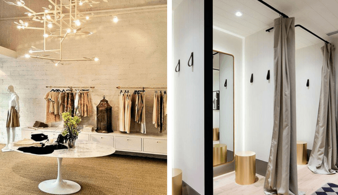
Ever wonder why some fast-fashion retailers use a curtain to close the dressing room rather than a full door? Turns out, it’s all about speed.
“A curtain feels temporary and is designed to speed up the process of a fitting room,” explained Zyla. “There’s that constant worry about how safe it is. ‘Is someone going to walk in on me while I’m changing?'”
With less-expensive garments, volume is key so retailers want you in and out quicker. There’s a certain level of anxiety and vulnerability in curtain-covered spaces, but it’s not all Machiavellian.
A private room with a slide hatch can feel like a sanctuary inside a bustling store, giving you time and space to answer text messages and become distracted. “A curtain prompts a fast decision and helps move the lines of a dressing room,” Zyla said. “It gets people to focus and it’s a good thing.”
It can actually help since it forces you to ditch the multitasking, even if just for a few minutes.
2. MIRRORS OUTSIDE OF THE DRESSING ROOM
If your dressing room doesn’t have its own mirror, that’s on purpose.
Retailers, specifically luxury retailers, may be using this as a method to force interaction with the sales team. A private moment instantly becomes public so that “you’re coming into a space with the sales associate where they can say it looks great (and) what it might go with,” Zyla said.
You may have also noticed fewer mirrors on the actual sales floor. This strategy coerces shoppers to take items to a fitting room where it’s staged with better lighting and mirrors.
3. STRATEGIC LIGHTING
When you sit down with a makeup artist, they may tell you if your skin is warm, cool or neutral toned thereby dictating which shades will be the most flattering for you. Retailers also want to use these clues when it comes to helping people look their best in the dressing room and many employ peach, pink and almond lighting to give your skin a glow.
Victoria’s Secret dressing rooms, for example, emit a signature pink hue that flatters any skin tone, and many even have a dimmer so you can explore mood lighting as well.
Vertical lights along both sides of an angled mirror is another popular dressing room trend since it’ll make you look evenly lit and slimmer since the light brightens the face and body.
Playing with light goes beyond the fitting room and into the sales floor itself. Retailers know they can guide the customer’s attention with lighting levels within the store.
“Generally, customers will only gravitate to areas that showcase well-lit merchandise,” said Uli Wagner from the Design Lab for Interior Architecture. Don’t be too surprised when you find yourself mindlessly walking towards that luxury handbag display that’s popping from across the department store!
4. THE CUSTOMER IS ALWAYS “RIGHT”
Next time you enter a store, consciously think about which side you gravitate toward. You might be surprised to find out that you’re being silently siphoned to the area where retailers are able to make the best margins from consumers.
“Nineteen out of 20 people are right-handed so, intuitively we turn right as soon as we enter a store,” explained Mark Ellwood, author of “Bargain Fever: How to Shop in a Discounted World.” Retailers stash what they really want you to pick up at the right of the entrance.
The left side of the floor is a “dead zone,” Ellwood added. “It’s almost like a stock room right on the floor with merchandise waiting to get marked down.”
So you may find some sales if you look to your left!
5. THE FLOOR PLAN MATTERS
Have you noticed that most stores don’t have windows? It’s not an accident.
“You lose track of the sun going down to keep you there and immerse you,” Zyla said. “You lose sight of the outside world.”
What about those chaotic clearance racks? Retailers will sometimes intentionally keep a display messy to make items seem more desirable. “Having that messy area makes it clear where you are and creates a bit of a frenzy, and you may say, ‘I might find a great deal and value in this area,'” said Zyla.
At luxury stores, however, retailers may keep the clearance sections in disarray to discourage shoppers from going there.

6. PLUSH CARPETING
Most luxury clothing stores are carpeted with extra padding. “If you’re walking around, you tend to stay longer because it’s more comfortable on your feet,” said Zyla. Look for this specifically at designer shoe salons, where comfort is key to a sale.
Carpeting also functions to slow you down since the slower you go, the more you notice merchandise around you.
7. ANCHORING AND DISCOUNTING
Stores will sometimes use a concept known as anchoring, where two similar items with different price tags are placed next to each other, making you believe you’re getting a great deal.
“Anchoring is part of our relationship with numbers that no one can explain,” Ellwood said. “When you see a product in a store that’s weirdly expensive, it’s there for one reason: to make everything else look cheaper!”
Ellwood offered J. Crew Collection boutique as an example. Instead of isolating the merchandise into a specific section, J. Crew sprinkles items throughout the store. For instance, a $900 blouse and $150 blouse that are pretty similar may be placed next to one another, helping you anchor the reference price at $900, which makes $150 look like a steal.
Electronics companies similarly employ the Goldilocks principle where they display items in trios since customers instinctively gravitate to the middle option. In fact, retailers buy most stock of the middle price point planning for this phenomenon, and it’s typically the merchandise with the best margin.
“If you check the features between the cheapest versus the middle one, you’ll find they are basically the same,” Ellwood pointed out.
8. IT’S A NUMBERS GAME
There’s a reason prices typically end in 7, 8, 9 and 0.
“Culturally, we have learned that nine is a standard ending and we don’t notice it much,” said Ellwood. When it doesn’t end in nine, we pay attention in a different way.
Prices that end in zero have become equated with quality. Nordstrom tends to price with round numbers, Ellwood said, and this suggests higher quality and a better value.
When we see an odd price, like $18.93, we assume that there was some formula used to calculate the price, that the retailer has cut it to the absolute minimum.
Never let yourself be duped, warned Ellwood. Try this trick: Round the price up to 99 cents. Do you still have the same reaction? If not, it’s not a bargain.
9. NEW TECHNOLOGY AND INNOVATION
Retailers know the likelihood of conversion increases when shoppers go into fitting rooms. And the expected sales per shopper increases more than 50 percent for each trip into the fitting room, explained Ray Hartjen, director of marketing and corporate communications at RetailNext. “Retailers also know that if a shopper has to put back on their own clothes to go out for a different size or style, she’s not going back into the fitting room,” he said.
With those data points in mind, retailers use technology to help eliminate or minimize any excuse shoppers might have to avoid fitting rooms. Advances like real-time alerts in dressing rooms allow staff to keep them clean from packaging and discarded merchandise, and in-room technologies allow shoppers to connect with sales associates directly to request different sizes, styles and accessories.
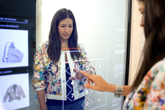
“Selfie-worthy dressing rooms are a key way to get customers to spend more time and to be brand ambassadors for a brand,” explains The Lion’esque Group‘s chief pop-up design architect, Melissa Gonzalez. Customers want to look good and share cool experiences. RFID-powered mirrors allow customers to seamlessly complete a look or request additional items be brought to a dressing room.

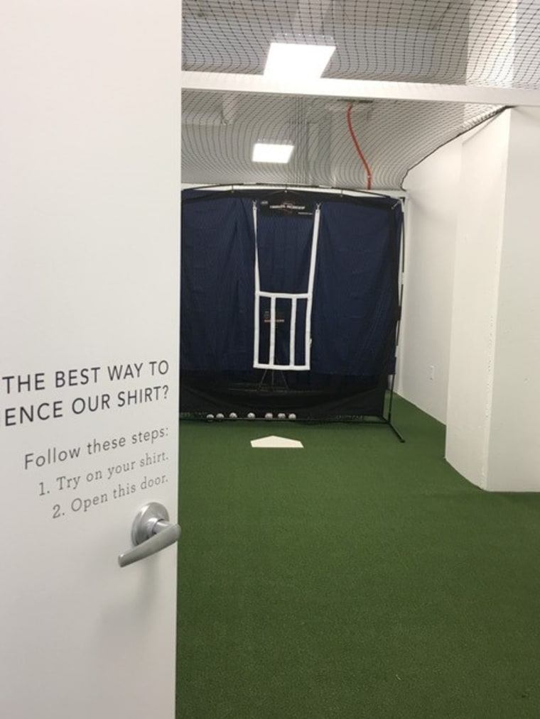
A cool example is that Mizzen+Main, which is known for their performance fabric, sweat-wicking shirts, equipped their fitting rooms with a secret passageway, which opens into a hidden pitching mound where guests can test their skills.

Eyewear line Privé Revaux opened an experiential flagship store in New York City featuring Instagram-worthy vignettes inspired by the glasses.
“In our NYC store, we gave the customer a fun experience where they can interact with the product and see themselves in different settings with backdrops that are perfect social media moments,” founder David Schottenstein said. “By creating a fun and inviting environment, we make happy customers, which usually leads to purchases.”
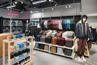
In the fall of 2017, American Eagle opened AE Studio in New York City where they offer denim customization, laundry services for students, a community event space and a living room to relax. “We are constantly testing new ideas to learn what our customer loves and see what we could roll out to other stores in our fleet,” said AE’s global brand president, Chad Kessler.
10. OTHER SALES TACTICS YOU NEED TO KNOW:
- If an associate physically hands you a garment, you may be more inclined to buy it because you’re now holding it. It’s a psychological tactic that’s been rumored to be used at retail stores.
- Most luxury stores prefer you don’t buy an item if you aren’t convinced it’s right. They theorize that every time you see it hanging in closet unworn, it’s a reminder of a foolish choice and you might blame yourself, the store or sales associate. That reminder may keep you from shopping there again.
Leave a Reply